Yasuke is my first large-scale solo project outside of game jams. It started as a narrative design project in college and slowly shifted into a primarily combat-focused project.
Yasuke tells the story of the first-ever black samurai and his journey throughout Japan, exploring the difficulties he faced along the way. While the project did start with the story and does have some narrative elements, what I primarily created in Unreal Engine 5 was focused on combat design.
From the very beginning, I knew I wanted to create a combat similar to that of Sekiro's. I love how aggressive it is, for example, while many games would force you to dodge away from thrust/stab attacks, Sekiro takes a different approach and lets the player aggressively dodge toward the enemy, performing a Mikiri counter. This forces players to consider how they can offensively react to enemy actions, keeping the pace of combat fast, while also giving more opportunities for counterplay.
Given I was styling combat after that of Sekiro, I knew that the Parry system would be the most important part to get right. I started by implementing some basic sword trace logic to allow me to detect whether an enemy was hit. I opted to set up my sword trace using weapon sockets spread across individual skeleton meshes (for weapons) so that each could have its own unique set of traces - this would eventually allow me to detect whether an enemy was hit with the point, blade, or hilt of a weapon.
Now that I had the weapon trace setup I moved on to setting up the parry system.
Parry systems, truth be told, are easy to make and hard to get right. They don't require complex math calculations or anything fancy, but a simple check if the player was blocking within a certain point of the enemy's attack.
The hard part with parry systems is the refinement, getting the timing and visuals right so it doesn't just activate, it feels amazing to activate. The player should strive to parry, it should be the go-to action when they see an attack coming towards them -- though sometimes they should dodge.
I chose to keep the actual visuals and gameplay reaction minimal, like Sekiro but unlike God of War or the Souls games. I wanted the parry to be something you did frequently and loved doing, not necessarily a "major" moment during gameplay -- that job fell to the deathblow.
Arguably the most important part of a parry isn't the visuals, but the sound design. Sound design isn't the most obvious, but it's what brings the whole thing together. Cool visuals are nice and all, but without sound to back them up and give "meaning" they can fall flat. I looked for a long time to find a sound that I liked, and truth be told I'm still looking, but my current SFX works quite well.
VFXs are custom while the SFX are sourced from the Unreal Marketplace.
Creating a good combo system, or rather the way the player attacks, is arguably the one thing you really can't get wrong. If the player doesn't like attacking why would they?
There are a couple of ways to structure a combo system. Most games take a simple approach and simply increment through a set of attack animations and loop through this process. Other games, like God of War, might change the combo to adapt to weapon changes, heavy or light attacks, etc. The latter creates more challenging combat, as the player might need to remember tons of different combo variations for different situations (though more often than not you can stick to the base combo if needed).
The problem with this kind of combat, in my view, is a lot of the intricacies go to waste, and not many players take full advantage of the system. In a project of my scale, I simply couldn't afford to spend the time developing a complex combo system that most players probably wouldn't touch. That's not to say the aforementioned system is bad, I would love to do something similar with more resources, but one of the challenges with game dev is working within constraints.
One of the keys with a combo system is the visual feedback that your attack went off, and more specifically the region it affected. To address this issue I opted to create a weapon trail, a common combat design trope. At first, I tried a complex weapon trail, something flashy and bold; there was no way the player would miss it. Eventually though, after some playtesting, I felt like it detracted too much from the core combat and became an eyesore.
In response to this, I pivoted and went minimalistic, trying nothing but simple refraction. This yielded the inverse and felt too lackluster, so I brought back some of the old flares. I wanted to make sure that players 1. knew where their sword would hit, 2. enjoyed the visual feedback from their weapon.
This yielded the results on the right.
Old Weapon Trail
New Weapon Trail
My favorite part of Sekiro: Shadows Die Twice, is probably the deathblows/executions. Unlike a lot of RPGs, Sekiro doesn't just have the enemy or boss flop over when they die, instead, the player must execute a brutal death blow on the enemy that drives home how intense the fight is. In other words: deathblows reflect intensity.
I started by focusing on deathblow speed; a lot of times when you deathblow you've parried 10+ times, and were potentially on the ropes about to die, so speed is key. Just as the deathblow reflects intensity, speed reflects pacing.
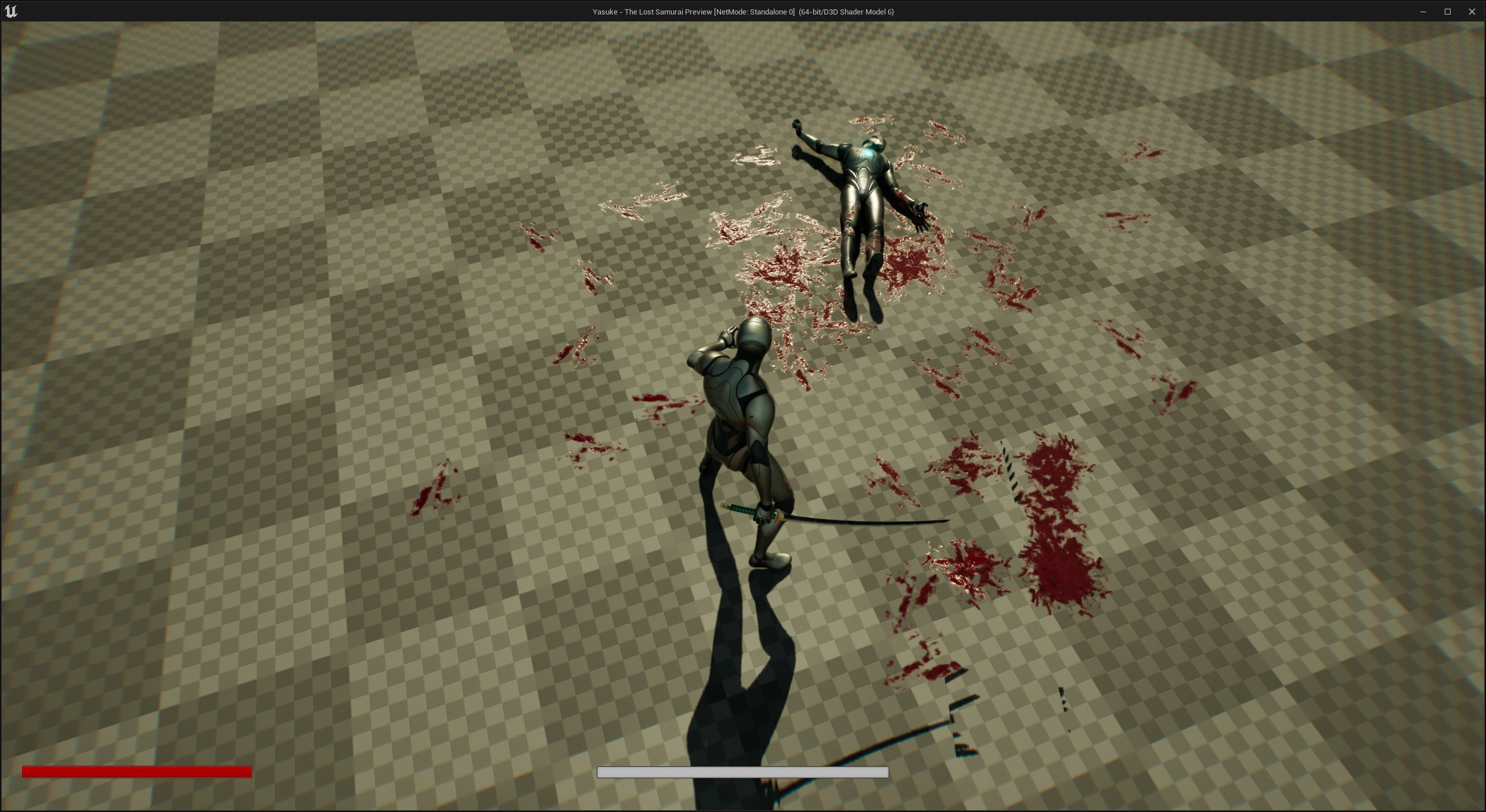
After that, I moved on to camera shake and visual representation of the deathblow. As discussed in hit reactions I use camera shake sparingly, but one place I use it a lot is in deathblows. It was important to me that the player knew this action was different than the rest of the combat I have. I wanted the player to know that this time they were slicing through flesh and bone, and the camera should tell them that.
Along with the camera shake, I focused a lot of blood VFX. Too much blood can detract from the execution, but too little can make it feel weightless and artificial. I opted to work on a case-by-case basis with a general rule of: "The harder the enemy the bloodier the kill." This meant that big bosses had big deathblows, while simple enemies were more minimalistic but still impactful.
This also visually lets the player feel a sense of progression as they move through the world, with harder enemies not just reflecting their strength via stats, but also via the feedback and underlying combat.
Example of what a generic deathblow looks like.
Example of what a boss deathblow looks like -- notice the added flair.
Before changes to the system