Unreal Engine Overview
Role
- User Interface Designer
Tools
- Figma
Deliverables
- Project Proposal
- Prototype
Duration
- 2 Months, (Jan 2024 - March 2024)
Project Overview
Over the course of two months I was tasked with developing an informational website for a project of my choice. Using a variety of User Interface design principles I created a website covering Unreal Engine 5. This project required constant iteration to ensure maximum usability and memorization.
Project Goals
When setting the initial goals three things immediately came to mind: approachability, concise, and representative. Approachability meant anyone could use the site, even though it may have fancy graphics or stylization. Concise meant it needed to be short and sweet, nothing overly technical that would confuse users or drive them away. This is an innate challenge given the technology I'm attempting to cover, but it was a goal nonetheless. Lastly was representative as the website, though short, needed to be able to convey the vast nature of Unreal Engine 5 without giving any misconceptions. This is hard to ascertain via user tests so I largely had to rely on my own knowledge.

Development Process
Project Proposal
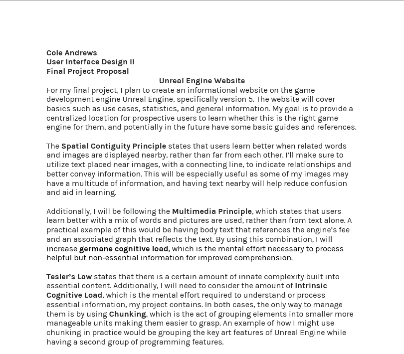
Before starting work on a Figma prototype I was first required to write a proposal explaining how I would use a series of User Interface laws and principles in my final project. Throughout my proposal I gave detailed explanations of how I would use each law in my final project. While the final prototype doesn't match the proposal one to one, it is quite similar.
User Interface Laws
Serial Position Effect -
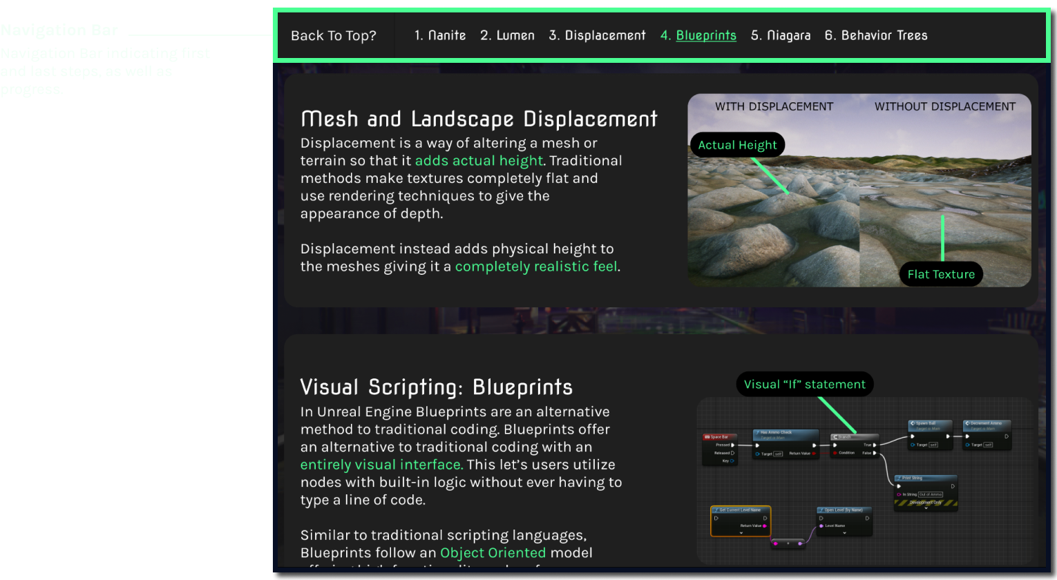
The Serial Position Effect refers to how individuals tend to remember the items toward the beginning and end of a list. With this in mind I opted to create a navbar with numbered steps that would be persistent as the user scrolled down the page. This became a constant reminder to the users and helped them recall information.
Von Restorff Effect -
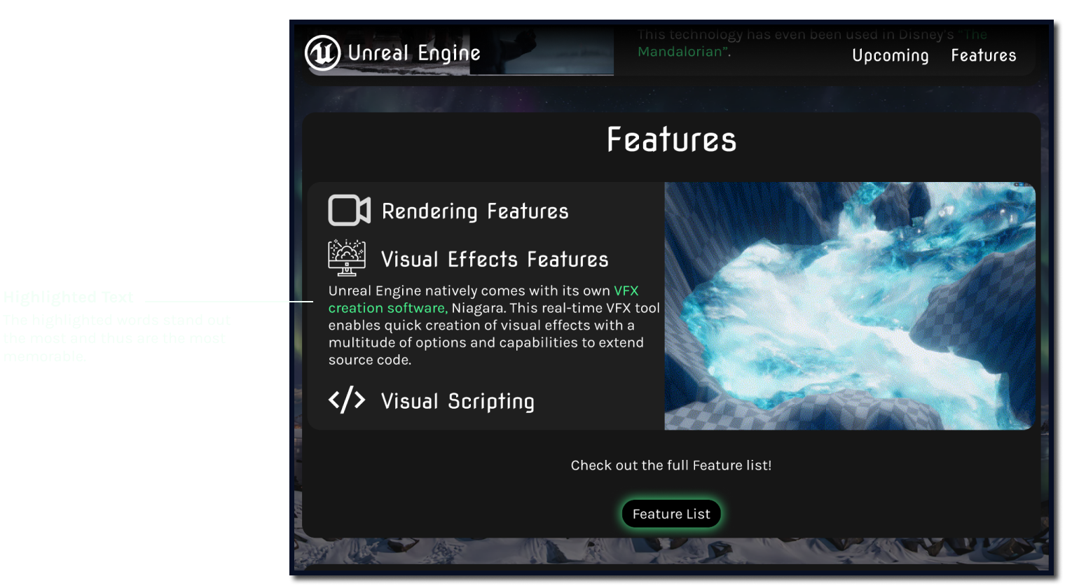
The Von Restorff Effect states that when multiple objects are similar, the one that is most visually distinct is most likely to be remembered. You can see this law at work in the image below, with the text indicating what kind of software it is being highlighted. This immediately makes the critical information stand out, and as a result is more likely to be remembered.
Coherence Principle -
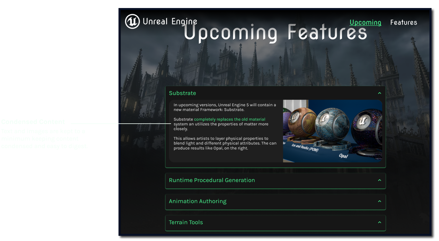
The Coherence Principle, which states that users learn better when extraneous or unnecessary words, pictures, or other elements are omitted, played a big role in my project. Throughout my project I had to carefully curate and select what kinds of images and text I wanted to display to the user. Due to the technical complexity of Unreal Engine 5 this was a significant undertaking that required multiple iterations.
Final Prototype
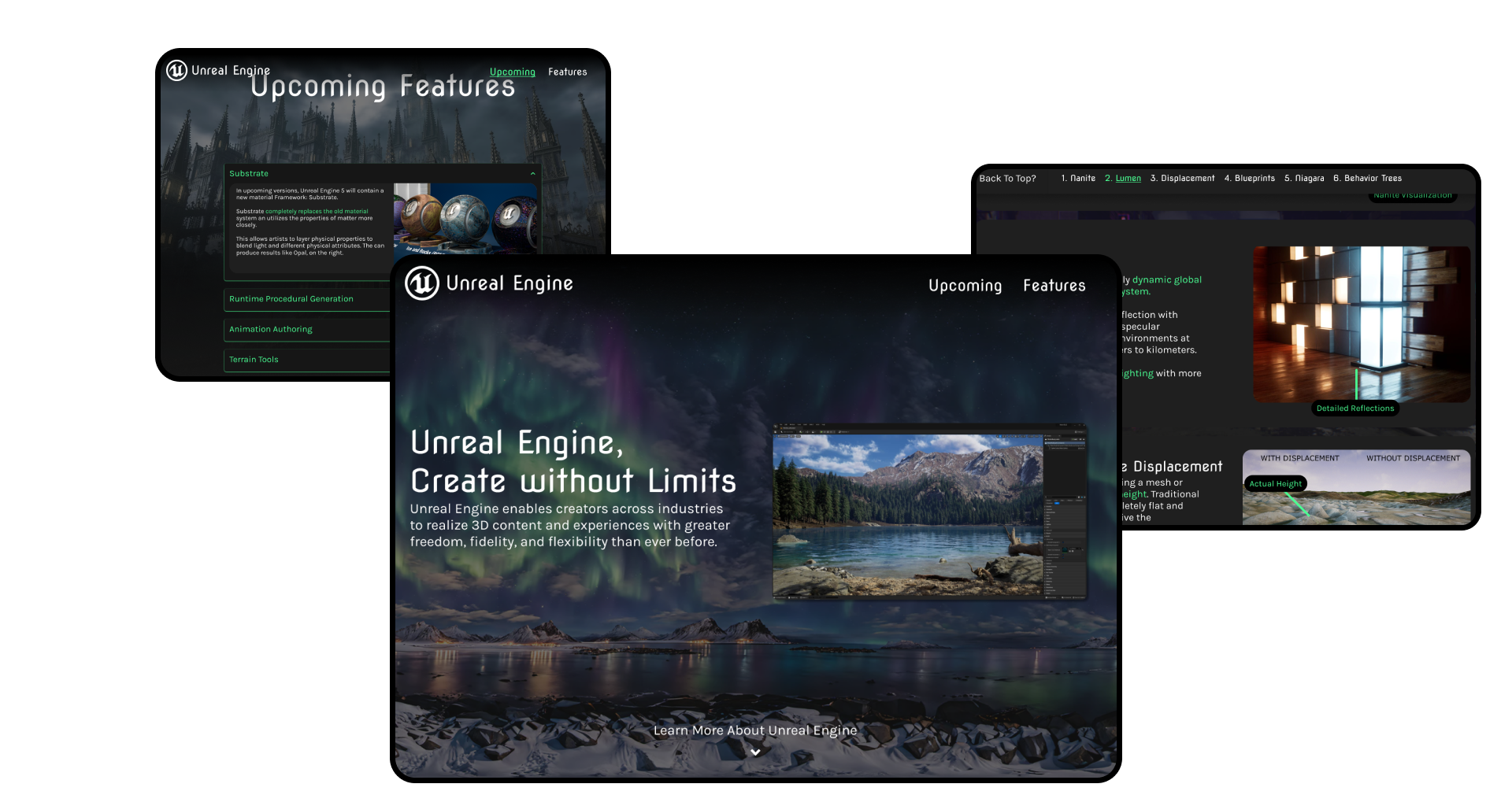
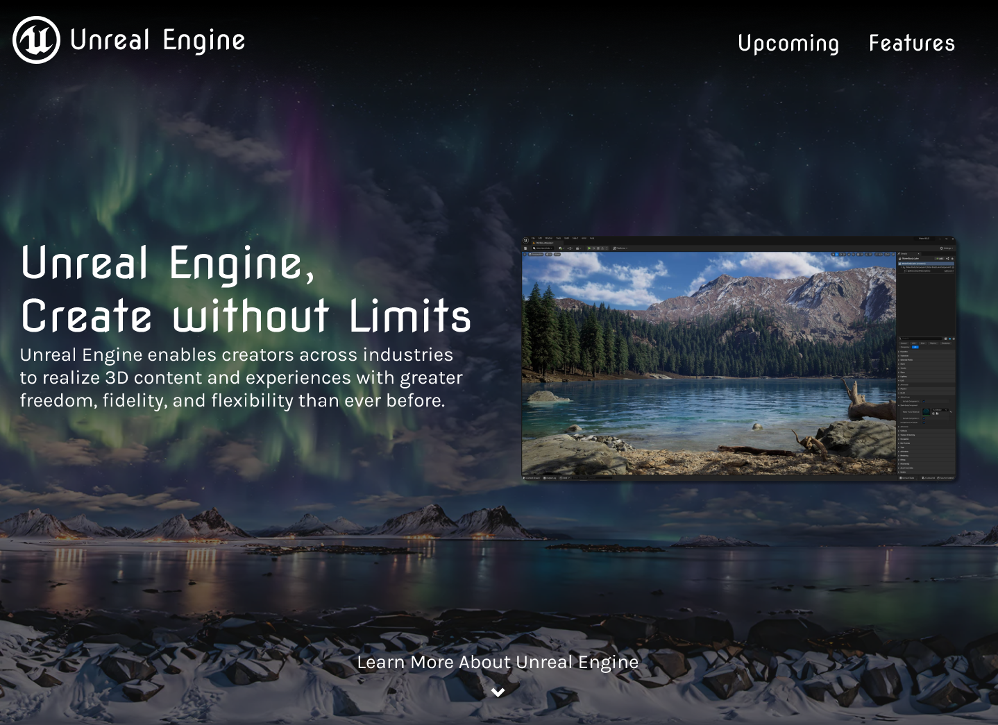
My final prototype was designed to give a brief but thorough overview of Unreal Engine 5. The project was divided into three main sections: a home page, features page, and upcoming features page. The home page was designed as an eye-catcher and lead in for the other pages. The features tab covered the features I thought were most notable. In a similar manner, the upcoming features page was a curated list of upcoming features and what they might entail. This project was completed on March 23, 2024 with very few minor revision since then. It went through three majors versions: first pass, full prototype, prototyped revised.
Retrospective:
I expected this class to be similar to User Interface Design I, and in many ways it was, but it also challenged me in surprising ways. For example, while my initial prototypes were heavily targeted towards the games industry, which was my target audience, other users felt the site a bit confusing and hard to navigate. This makes sense, as they would be unfamiliar with the design standards found in games, so finding a middle ground between usable and impressive was a big challenge and I took on head first.
I found this project to be an excellent way to strengthen my Figma skills and build upon existing knowledge. I was shocked just how little I was taking advantage of Figma's true capabilities. I'm excited to see how the knowledge I've gained throughout this semester will advance my career!
