Sprint One
Throughout the duration of sprint one I led my team through our first iteration of the Lean UX canvas and initial research and concept validation phase. We started design week zero by completing the Lean UX Canvas before moving onto prototyping and research in weeks one and two. Over the course of our two-week prototyping and research period we completed a total of six interviews.
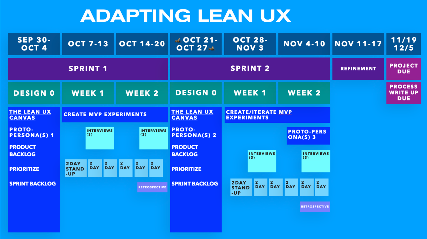
Sprint One, Design Week Zero
As part of our class, we were utilizing an iteration of Lean UX (and more broadly the sprint system) that has a design week zero. This makes our total sprint duration three weeks, but week zero is focused primarily on the lean UX canvas. The lean UX canvas is broken up into eight sections focused on understanding business needs, hypotheses, and minimum viable products (MVPs).

The goal of box one, Business Problems, is to identify our domain, focus, and ways to measure success. Through this step we were able to identify that our domain was primarily a job database similar to LinkedIn. Our focus was on streamlining the job search process and cutting down on bloat. While our ways to measure success would stem from whether users were able to get jobs and choose our site over competitors.
The outcome of box two is to better understand how our designs align with business goals. This is done through mapping impacts (business goals) to user actions (leading, lagging indicators). Our impact metrics were whether the user got a job or whether we were retaining users. These two metrics were supported by user behaviors like signing up for job notifications (lagging) or browsing the job board (leading).
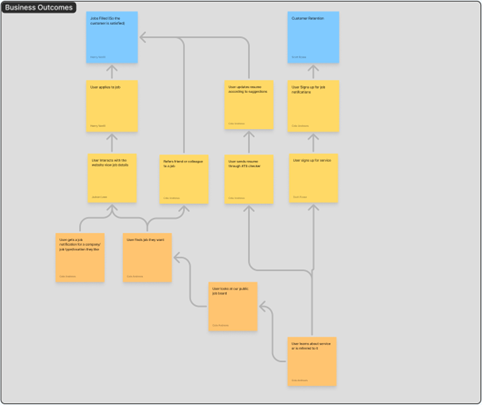
Box three’s goal is to begin identifying out user types using something called a proto-persona. These personas are crafted by considering what goals or needs our user has and what obstacles stand in their way. This helps us to identify clear measurable issues in our hypothetical users. As this was our first iteration of the canvas we created two proto-personas, Ella and Mike. Two personas were distinguished by their career paths – already in the industry vs trying to break in. In Ella’s case she would be looking to change jobs or create a better resume, whereas Mike is trying to understand how to get a job and what each job does.
Box four is focused on the user outcome and benefits, and it poses a series of questions designed to get you to think about critical elements of the product. One of the main questions is “why would the user seek out your product?” This is a question we could answer easily due to our previous work in box one, which outlined the domain and some of our improvements. Namely, users would use Hirescape because of how streamlined it is – that is users can more quickly find jobs they want to apply for.
Within box five we complete an affinity map based on proposed solutions, features, or product enhancements. The idea is that each team member begins to write out what components of our product might exist and what category they fall under. This part of the canvas is especially important as it begins to detail what kind of features we will need to prototype – for example what kind of interaction does the user have when searching for a job?
Box six unifies everything we’ve done thus far into concrete statements. These statements are constructed based on business outcomes, user benefits, and features. In this box we can detail exactly what impact metrics (benefits) are impacted by specific features (derived from box 5) and what user it correlates to. My team and I noticed that the vast majority of our features related to search filtering (e.g. the job is within X distance), leading to a lot of similarity in our statements. This was fine, however, as it gave us a clear direction for weeks one and two of the sprint – when we would begin prototyping.
Boxes seven and eight are similar in function in that we take the already created hypothesis table and order it by risk (box seven) and then explain how we will test it (box eight). These two steps require a good understanding of the dependencies of each feature and its resulting impacts. For example, on our website we can’t simply search filters, but rather both filtering options and jobs to filter. Otherwise, the experience is too static and detracted from one another.
The last step of week zero is taking our hypothesis table and turning that into a product backlog. A product backlog is a list of the features we are planning to implement, with a section iteration called the sprint backlog specifically denoting which features we are planning to get done this sprint. With our sprint backlog we detailed six total features we wanted to develop over sprint on. Most of these features were filtering options with some variation.
Sprint One, Week One
As we entered week one of sprint one, we needed to accomplish a few core goals. The first major objective was translating our canvas into a real prototype. The second main objective was scheduling and conducting three interviews. Our team also needed to complete a total of three stand up meetings on Tuesday, Thursday, and Saturday. Stand-ups, for those unfamiliar, are short 15-minute meetings designed to check in with teammates and understand how much progress they’ve made as well as identify any potential issues.
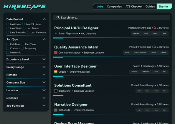
Utilizing our sprint backlog I analyzed the core features that could be divided into a kind of mini-mvp. These were smaller parts of our larger product we could rapidly prototype and test. I identified a few core areas: a home page, job details page, filtering options, and search results. Each of the aforementioned sections could be developed in isolation and then slotted into the larger product. In the case of filtering, it could largely be developed without knowledge or awareness of what the job pages looked like.
This created a very clear development schedule we could utilize that provided our team the ability to work quickly. This also enabled our team to test different iterations faster as we didn’t have interlocked dependencies that would cause things to break if major changes were made. This style of development was heavily influenced by my background in game/software development which uses a similar approach.
As we turned to interviewing our team’s primary goal for this week was not to test our prototype, but rather to understand user needs better. Thus far we have been working off of our own assumptions rather than a data driven research centric approach. This meant it was entirely possible that our assumptions were wrong, and as such we needed to quickly confirm our market and product idea.
I started by looking for candidates within our target audience, they needed to have some interest or existing career in the tech or games industries. As my personal focus is on the latter, games, I looked for interviewees in that market. I found our first two interviewees through personal connection and conducted a preliminary screening to ensure they matched our audience. Our third candidate, however, came from one of my teammates Scott Rzasa who contacted an animation major he knew.
The three interviews we conducted were all run in a similar fashion, though two were in person and one was online. Each interview’s questions were focused on understanding what flaws or issues existing job platforms have, while also attempting to decern potential areas of innovation (particularly regarding our ATS Checker). An example of one of the questions we asked is “What are some of the things you look for when applying to a job?”
Our first two interviews, which I led, lasted over thirty minutes and covered all of our core features and markets. Both interviewees had spent significant time applying for jobs before landing their current roles. However, throughout both interviews they noted that finding jobs worth applying to was very difficult, particularly when attempting to use any kind of filtering. It was clear that while existing job boards offer good filters, they aren’t always easy to use and rarely yield jobs worth applying to. Both candidates also noted that while they were vaguely familiar with ATS systems, they wouldn’t be able to explain them or reliably guess whether their resumes would pass a review.
Our third and final interview for the week was very different from the first two. Our interviewee, an animation major, was not someone who used any job boards like LinkedIn but rather relied entirely on referrals for landing jobs. In particular she noted that for animators the application process was slightly different, prioritizing portfolio over resume. This meant that our core product and features we were proposing like the ATS checker weren’t useful to her, at least in their current concept.
All three participants noted that company culture and history are very important. Particularly in the case of the animation major, she noted that she wouldn’t want to work for a no-named studio that hadn’t made good projects, but rather a company with a storied history. This presented a new insight as it was clear users cared way more about the company culture than the location or size alone.
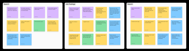
After each interview my team and I completed affinity maps. These let us collect our notes and understand common problems or notes. Because of this we were able to quickly understand which aspects of the current market or our website we should focus on. By in large what we saw reflected our initial canvas – filtering and removing bloat is arguably the biggest selling point. However, there was some surprising focus on companies which we noted for later reevaluation.
Sprint One, Week Two
Heading into week two of sprint one it was time to begin translating our interviews into tangible designs. Because the bulk of our interviews were research focused, rather than testing, we had a good idea of what users were looking for. Our prototype for this week was going to be focused on testing whether we had sufficient filter options, the job results were intuitive, and whether our homepage was effectively redirecting users to the rest of the website.
One challenge, before we could conduct any interviews, was actually finding interviewees. Our first week we were able to find three participants rather quickly, however that was not the case for week two. Our team had significant trouble finding anyone who could meet at the times we were available and as such we had to broaden our candidate pool from specifically individuals within the tech & games industries but rather all industries.
This resulted in two of our three interviewees from this week not being within our audience. While this could arguably be dismissed as unusable data, we instead used this opportunity to see how individuals outside our audience might use our website. This was especially important as someone looking to get into the games industry may turn to our website for guides or the ATS checker.
We approached all three interviews in a similar way to week one, however instead of spending as much time on research focused questions we instead dedicated over half our time to testing our prototype. Our questions were primarily focused on understanding the psychology of users and how they felt about our direction.
The reason this was very critical is our website uses a somewhat novel visual design inspired by Cyberpunk movies and games. This style was chosen due to our audience being highly technical, but it could be too off-putting for users outside our audience. Our interviews more or less confirmed this concern, but surprisingly all our interviewees liked the style and could clearly see everything even though it was quite distinct.
There was a surprising number of unexpected changes we needed to make after week two. For example, multiple users noted that the filters options should be larger, dropdowns, and located on the left side. Additionally, we initially had a news tab on the homepage, but multiple users noted that they didn’t care about the news. It was interesting to hear how narrow focused users would be when using our site – they are coming here for jobs and not much else. As a result of these suggestions we quickly launched into iterating our prototype based on our feedback.
 As we had now completed all of our tasks for week two of sprint one, my team and I needed to complete a retrospective meeting. The goal of this meeting was to identify where our team was successful and where we faltered. The idea is that we could hopefully fix any problems going into sprint two and enhance areas we are succeeding. The meetings themselves are estimated to last around an hour and be relatively informal.
With that in mind, our team noted a few areas in particular that we needed to improve. Namely, scheduling interviews was a grueling process and was usually quite last minute. We needed to be scheduling further in advance to ensure all team members could be present for our interviews. One teammate also noted that we needed better communication as some teammates desired more direction than others.
Sprint Two
Sprint Two, Design Week Zero
As we entered week zero one sprint two our team didn’t initially expect much to change on our canvas. We had confirmed much of what we had written, but we also identified a few clear areas we needed to improve. This lead to much larger changes than we anticipated.
The first main box we changed was our business outcomes. While the overall box is more or less the same, we added a new impact metric as well as associated leading and lagging metrics for that impact metric. The metric we added was purchasing ATS scans, as part of our reevaluation put a higher emphasis on the ATS checker. This metric essentially stated that if a user was getting value out of our checker, they would need to purchase a scan to continue using it (driving up sales). We also took this time to rework some of our verbiage and shift around some of the leading and lagging metrics.
The next main box we changed was box three, the proto-persona. In our original canvas we had two different personas representing users from different walks of life, but upon reevaluation we found that these users were essentially the same. The distinction of already having a job in the tech industry vs not having one was not relevant enough factor to warrant an entirely separate persona. As such we merged our personas into a unified user, Lily, that accurately represented both perspectives (unemployed vs employed). We also updated our proto-persona’s goals as we had a better understanding of what issues current job seekers are facing.
With the bulk of our interviews focusing on the market itself we had a much better understanding of what kind of features users were looking for and as such we decided to completely remake box five. Our original affinity maps, while still valid, were not backed by the research we had done, so in contrast our new iteration was far more insight and reflective of the market we were trying to target. This reworked affinity map led to a lot of minor features that would elevate the UX, for example,
 As we had a new affinity map with a host of new product enhancements and features, we took this time to accordingly update our hypothesis tables (box six). In particular we focused on different sections of our website, for example having a place to contact recruiters directly or have a pop-up that prompts you to check your resume with ATS before applying. In either case these are two features that were derived from our interviews.
As we had updated our hypothesis table we also needed to update boxes seven and eight to match our new table. One of the biggest shifts we made was in our risk analysis – that is what feature is most risky. In particular we noted that search filtering is our riskiest element even though during our initial canvas it was ranked quite low. We made this shift primarily because we learned just how important the feature is to our overall product and how many things go into it. In other words, we cannot screw that part up as it is the core selling point of our website.
To summarize our changes, we updated our proto-personas and business outcomes based on our review and interviews. Additionally, we completely redid our affinity maps and hypothesis tables to better reflect our website’s direction and interview results. These changes placed search filtering at a much higher priority while also detailing additional features
Sprint Two, Week One
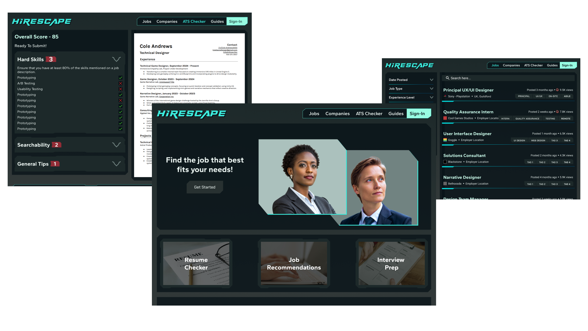
Going into week one of sprint two we had significantly more work to complete, as our project needed to be fully developed by the end of week two. This meant our MVPs were going to be much larger, though still developed independently like during sprint one. As the lead I decided to divide our team’s labor into the four different sections/experiences our website offered. Those sections were the guides, company page, ATS checker, and sign-in/user driven content.
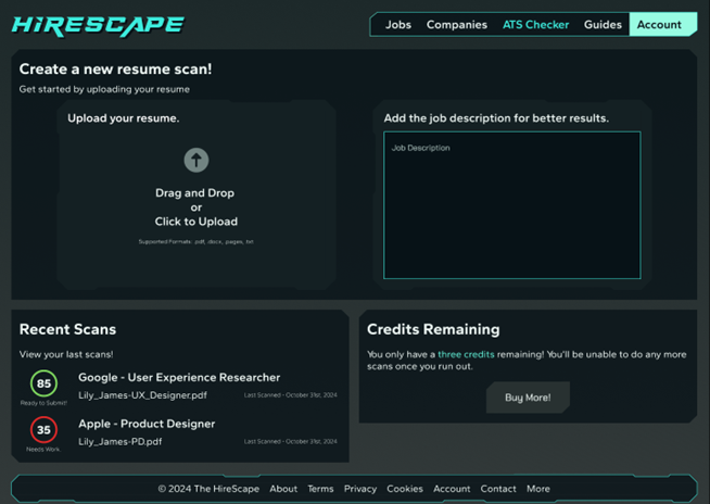
The ATS section, which is what I developed, was elevated to a higher priority and its scope increased based on our first set of interviews. The ATS pages were broken up into a few different sections: a landing page, upload sections, and resume review. Each page’s purpose and design were very distinct, meaning that they needed to be thoroughly tested and validated before proceeding.
On the landing page we prompted users to go through the page and reiterate the information they found most helpful or important. This helped us understand what users were deviating towards and what we needed to highlight more. This also gave users the chance to suggest changes or additions – for example, many interviewees mentioned adding testimonials.
Once the user signed in, we could have them walk through the resume upload process. Through our testing we found that the initial upload process wasn’t communicating enough information to the user. In particular interviewees noted that they wanted some kind of confirmation screen that their resume had successfully been uploaded.
Some interviewees also noted that the recent scans section was intuitive in its early iterations, and that it wasn’t clear what the resume was or what the score meant. As such we added the job title and upload date in addition to adding a subtle bit of text communicating to the user whether their resume is ready to upload.
On the resume feedback pages we conducted a series of A/B tests to see which designs worked best. In particular we were using a checkmark system to communicate to users whether they were conforming to ATS systems. Originally these checkmarks were blank without any kind of background, which made them blend in a bit too much. In order to determine which iteration was best (with or without a background) we began doing A/B tests. In each interview we would show the user one page with backgrounds around the checkmarks and one without them. The user would then give us feedback based on the two iterations, and we would alter our designs as needed.
 As a result of these tests we found that the majority of users preferred the back groundless checkmark, but that it was too hard to see. This led our team to decide to have the background version of the checkmark so that we could enhance clarity, even if it came at the expense of a slightly less visually appealing image.
Sprint Two, Week Two