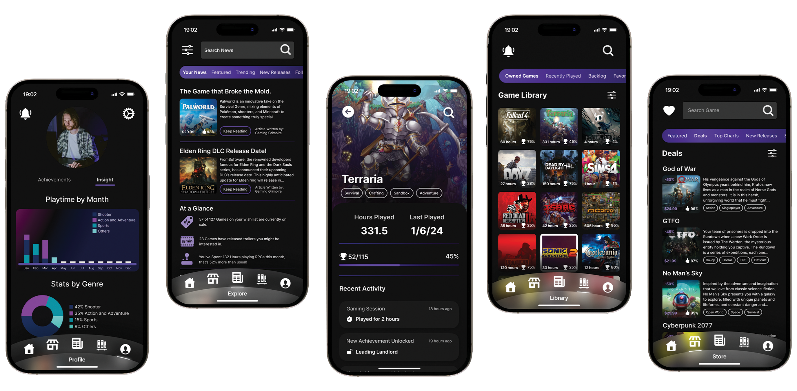
Development Process
Research
The first phase of the Goal Directed Design process involves extensive research. This is an essential phase that lays the groundwork for the following phases as it gives a greater insight into our domain, users, and stakeholder goals. The research phase can be broken down into five main steps:
-
Kickoff Meeting - Setting the stage for our project and better understanding our product's target audience and market.
-
Literature Review - Extensive research into our product's domain.
-
Competitive Audit - Market research into similar products or services.
-
Stakeholder Interviews - Theoretical expectations a stakeholder have or requirements they may impose.
-
User Interviews - Gain insight into user behaviors, attitudes, motivations, challenges, and other elements.
1. Kickoff Meeting
Our kickoff meeting was structured to help us better understand our product, its domain, and discuss relevant stakeholder questions surrounding our product.
These questions are vital to understand and address early on, as they give better insight into what we're making and why.
It is worth noting that this was a class project, meaning we had no stakeholders or clients to interface with, they were entirely hypothetical.
For our kickoff meeting we utilized Figjam where we followed along a worksheet with some questions related to our product. Throughout the meeting our team acted like stakeholders asking and answering questions.
2. Literature Review
The goal of the literature review is to increase our knowledge of our product's domain and as such we researched game platforms, player types, and achievement systems. Our research was focused on helping us understand players and how they interact with games and what the users need to succeed.
My research in particular was focused on game recommender systems, which argued that many players never touch a large portion of games they own. This research helped confirm the initial app pitch's foundation and help us understand what sections of our app we should focus on.
3. Competitive Audit
Quickly following the literature reviews our team pivoted to competitive audits. These audits were focused on similar apps such as PlayStation or Steam as we looked into what features of their apps did and didn't work.
After our competitive audits we found that the vast majority of apps were only good at one particular thing (ie. buying games or browsing your library) and not multiple things.
This created an obvious area for us to capitalize on in the market, in particular we found that the majority of apps did a very poor job of communicating new released and news to the user. One of the product's original goals was to help users better choose their next game and stay up to date on relevant issues, so this was a clear area for us to focus on.
4. Stakeholder Interviews
Due to us not having stakeholders to work with, our team instead relied on the worksheet we'd completed in our kickoff meeting. As mentioned prior, our team went through a series of questions that stakeholders might've asked and answered them.
These questions focused on product selling points, possible budget, user use cases, technical constraints, and monetization opportunities. After completing this we were able to make a few notable assumptions:
-
There is a large untapped user base that would be interested in our app.
-
Our primary monetization will stem from affiliate purchases and potential subscription models.
-
Our primary user base are avid gamers interested in finding better games to play as well as insights into their gaming activities.
5. User Interviews
The last step of the Research phase was User Interviews. Before selecting interview candidates we first narrowed our pool by sending out a google form with some preliminary questions. These questions were meant to verify that the interviewees would be in our target audience.
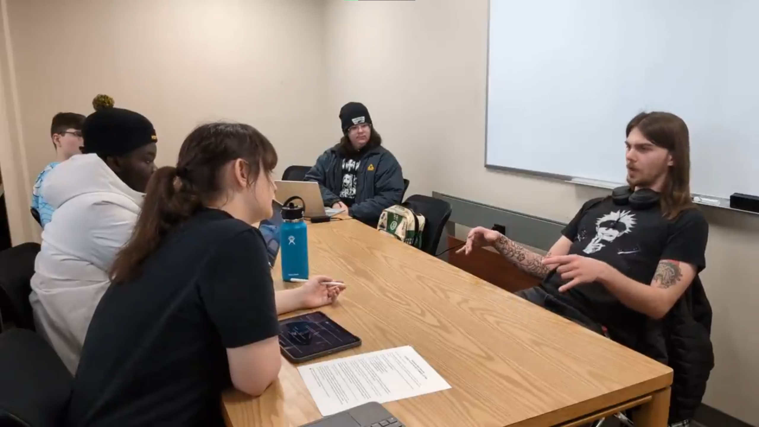
Form there, each member of my team had the chance to interview at least once, with some interviews being conducted in person and some online.
In the interview I conducted I focused primarily on how the user interacted with games -- what game genres did they like, do they look at achievements, etc. -- and the challenges the interviewee faced when using similar apps to ours. I was particularly interested in areas they felt they were undeserved or parts of the app(s) they found frustrating.
This line of questioning gave greater insight into where competitor apps were failing and helped verify our competitive audit we did earlier in step 3.
During my teammate's interviews we discovered that some of them weren't quite in our target audience -- we wanted more serious gamers while three of our interviewees were quite casual.
This created an interesting situation as we now had the majority of our interviews pertaining to a section or division of our app we considered secondary. For now we decided to move onto analyzing our affinity maps.

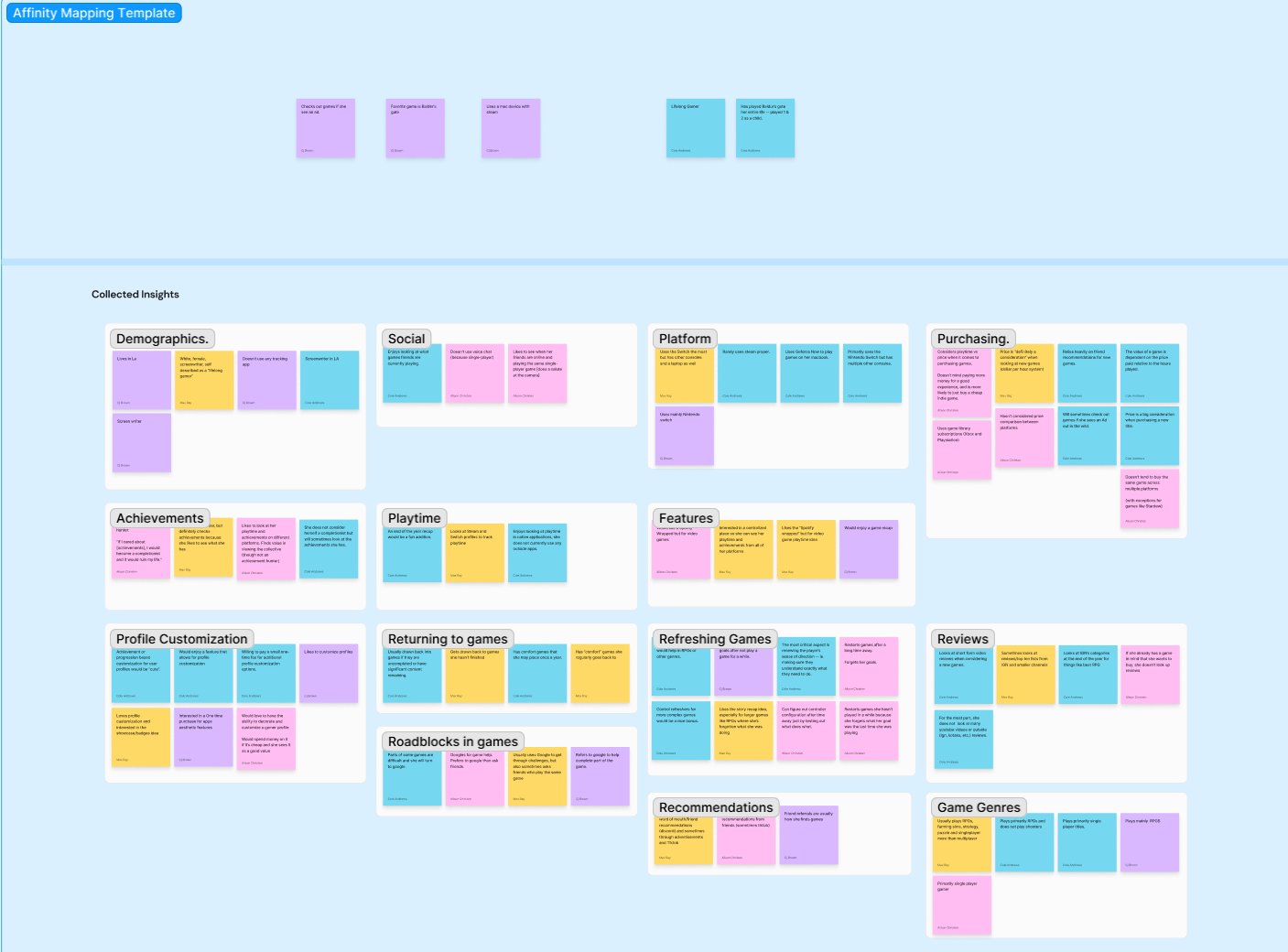
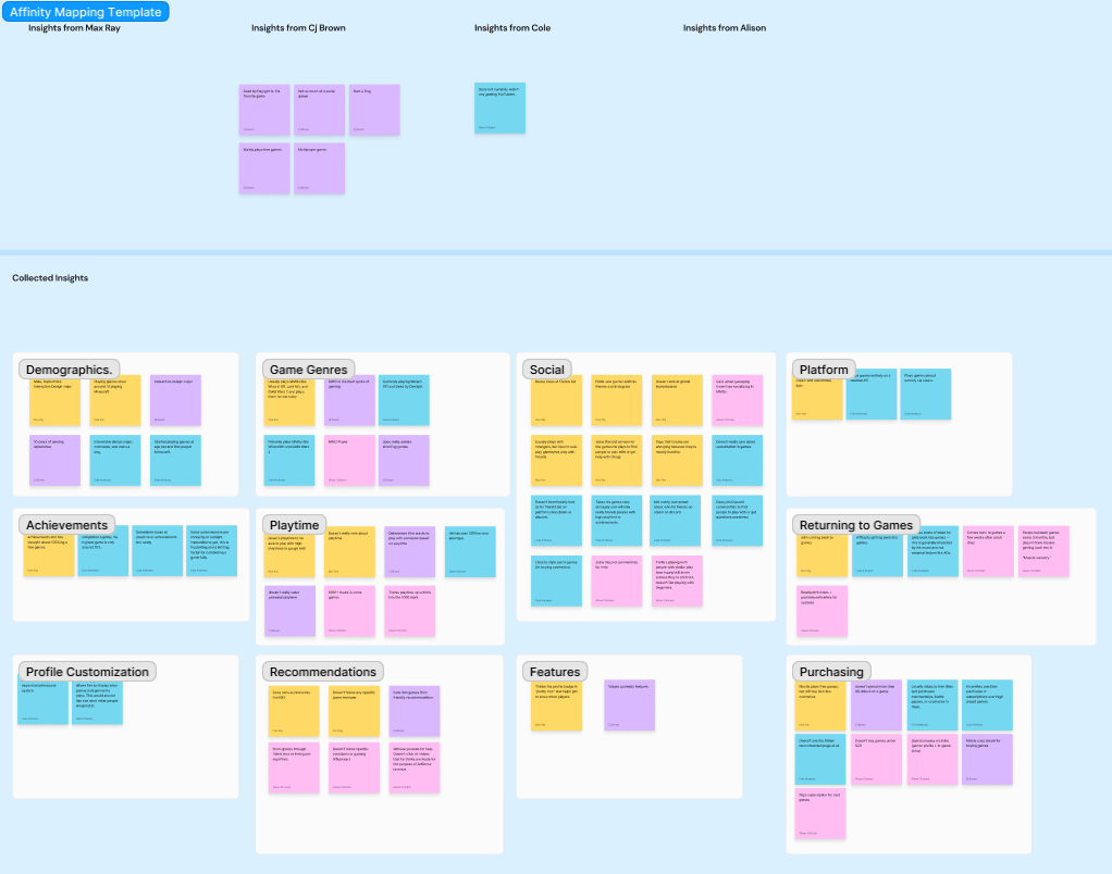
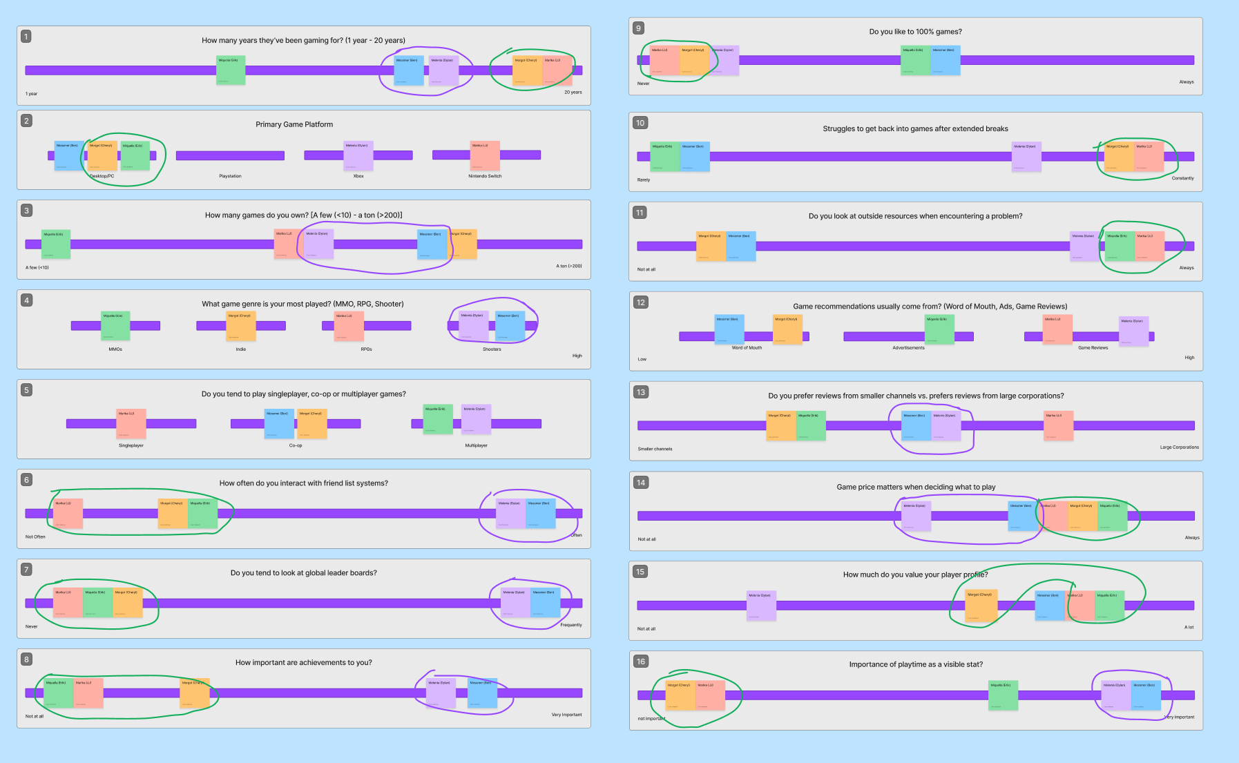
Affinity maps were completed after each interview as we analyzed the information we'd gathered. This data was grouped based on demographics and various player profile categories (see images), which helped identify patterns we'd noticed in each user. This grouping of information would then directly feed into the next phase of Goal Directed Design as we begin to make a persona.
Modeling
Behavior Variables
As we'd now completed our the research phase, our team turned to creating a primary persona for our target user. Before this, however, we had a significant amount of data to pour through and utilized behavior variables to distill this information.
Behavior variables let us identify groupings in the way our interviewees answered questions. As mentioned prior, though, we noticed that we had a split between casual and serious gamers when doing our user interviews.
This theory was confirmed when we analyzed our patterns, noticing that two of our interviewees would usually respond similarly, while the other three users responded differently, but quite similar to one another.
It was at this point as team leader I decided we would need two personas. My team concurred and we now were considering our data as two separate users (personas).
The smaller grouping, the two serious gamers, would become our primary persona, while the larger grouping of three, the casual gamers, would become our secondary persona.

Developing The Personas
Personas are fictional characters that acts as a stand in or representation of our typical user(s). Because we knew that we'd have two personas, a primary and secondary, we took to crafting two different identities.
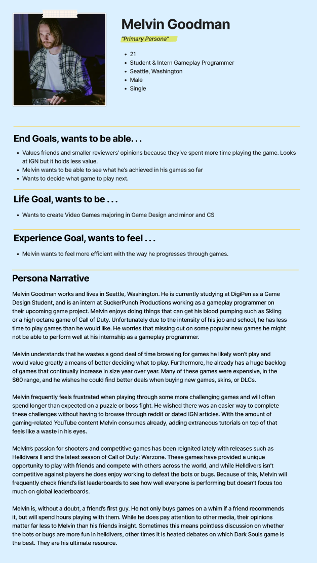
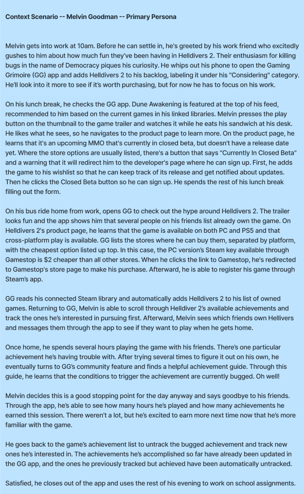
Our primary Persona, called Melvin Goodman, was crafted around the patterns we observed in our two serious gamers we interviewed. Part of this process involves creating a persona narrative, which is a sort of biography about them and their characterization.
Melvin in particular was the personification of our hardcore gamer, as he is a current game development major and intern at a game studio, SuckerPunch Productions. Additionally, when writing his persona I tried to consider how he might interact with elements outside of our app such as game reviews, trailers, and how he interacts with friends.
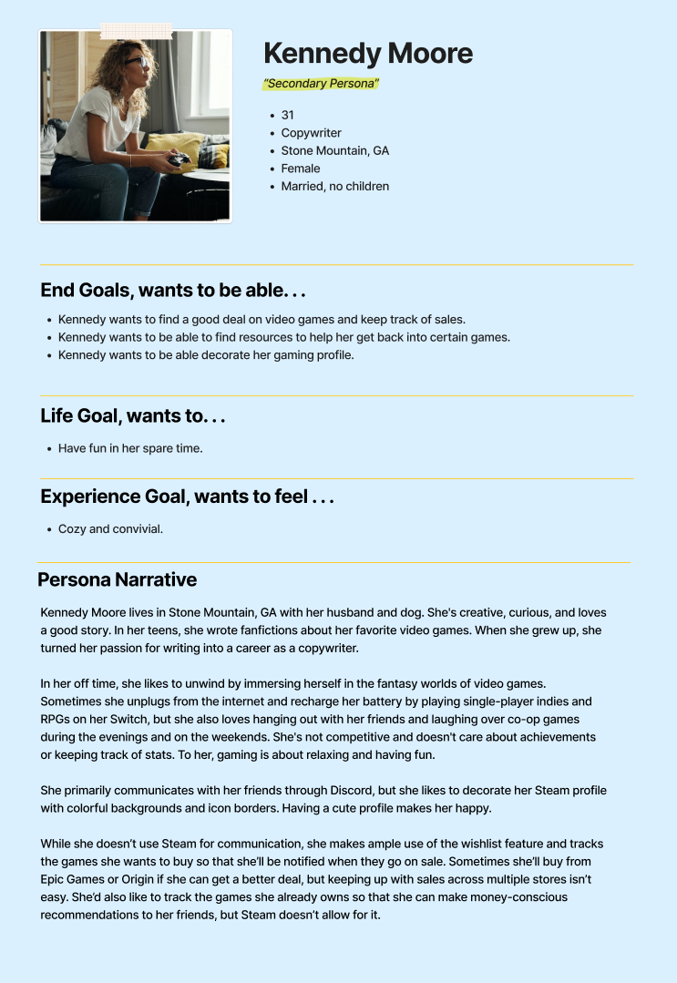
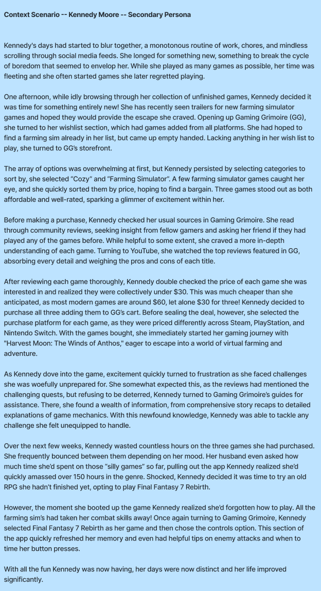
Our secondary Persona, Kennedy Moore, was written by Alison Christen and focused on our secondary audience. Kennedy was the personification of a casual gamer who uses our app in a more casual modality. She doesn't focus too much on friends or new titles, but rather uses games as a simple method to unplug from life.
After reading through the two narratives the purpose behind having two personas should be clear, as their goals and the way they interact with games are completely different. As such, their use cases and how they utilize our app will be different. Thus we need to consider two different user bases and what they need to succeed when using our app, Gaming Grimoire.
